
Launch: A Mobile App Design Process
Brainstorming
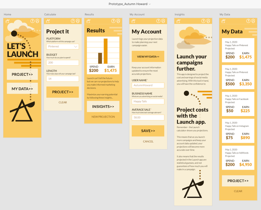
The objective: to design a mobile calculator application.
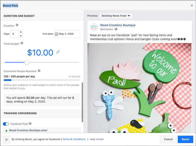
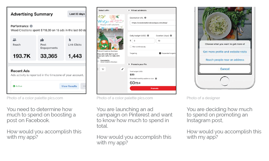
As I started researching existing calculator apps on the market, I saw examples of baking conversion apps, loan calculators, tipping calculator apps, and many other great ideas. I didn't see an app for something that I regularly project- social media advertisement expenditures versus earnings. I decided to go in that direction for my design process. Not all of the variables for accurate computing are represented in this project overview: at this point it's all about the process behind designing a successful final look.
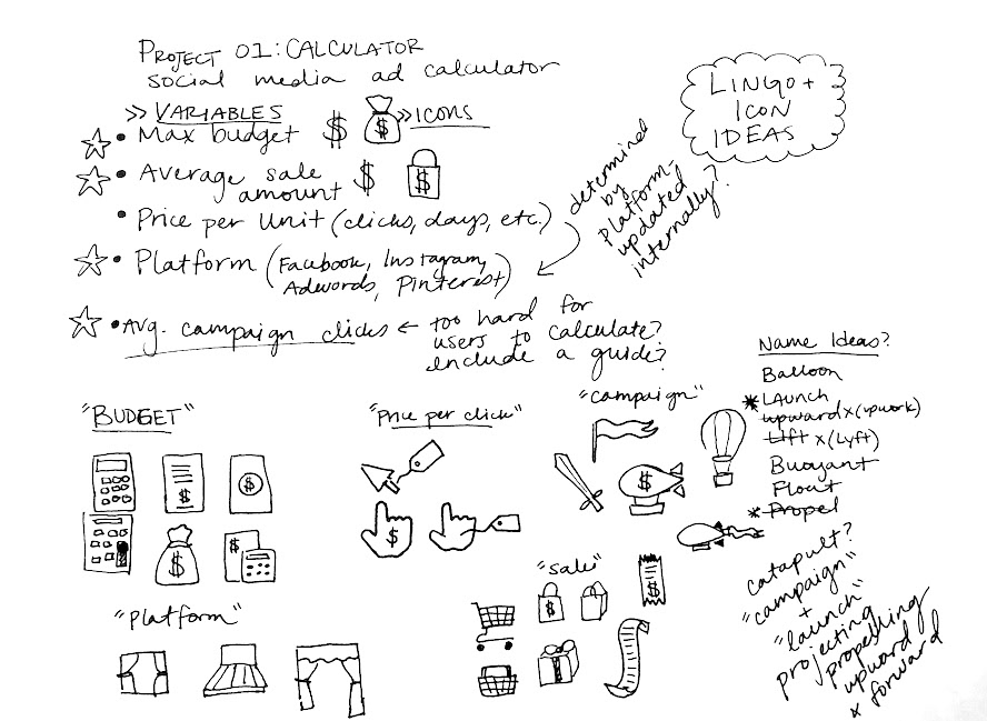
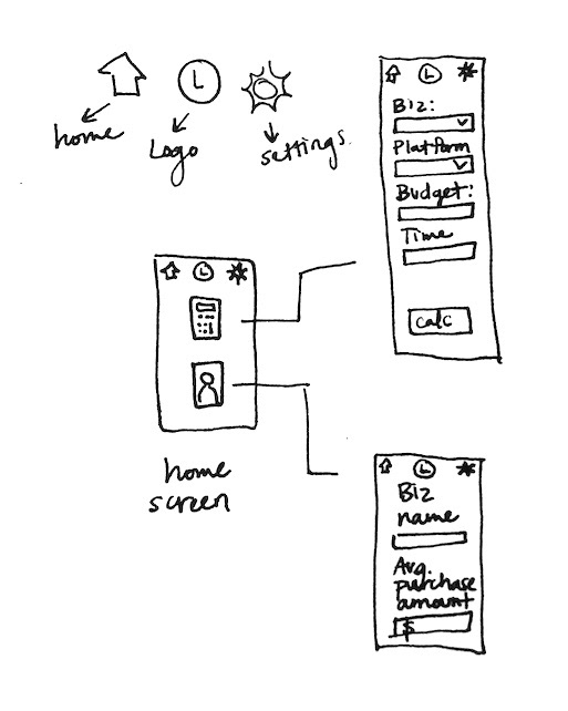
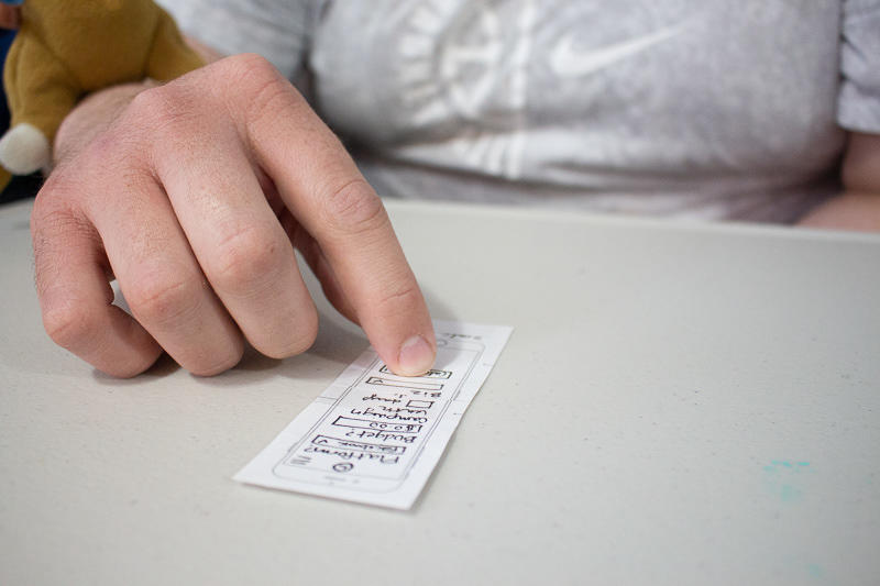
After settling on my initial app idea, I began sketching and brainstorming ideas related to the intended functionality of my app. I created rough wireframes and gathered user feedback on the initial paper prototypes.
Target Audience + User Testing
The target audience for this app includes social media managers and small business owners. These are individuals and teams that are trying to drive sales, increase brand awareness, or generate traffic to their site. They are looking to acquire metrics that will progress their goals through tools that are sleek and easy to use. They don't get excited about extravagance– rather, they get excited by solutions that produce results.
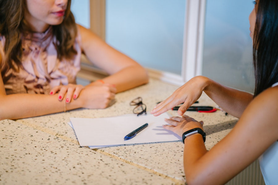
With initial user feedback, and audience in mind, and scenarios established, I refined my wireframes and created a functional digital prototype using Adobe XD. I conducted a second round of user testing, this time remotely using screen sharing to observe as the users attempted to carry out the scenarios they were given.
Visual Design + Prototype
During brainstorming, I linked together these ideas:
Campaign
Launch
Catapult
Projectiles
Propelling
Upward + Forward
Rolling these elements together, I am working to create a brand image that represents the idea of launching a social media campaign with power and precision.
The bright yellow palette speaks to something being dangerous, daring, and under construction. These ideas communicate to the nature of this app.
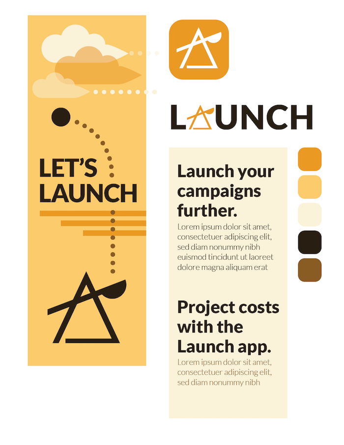
I decided on a monochromatic palette to add some sophistication to the vibrant yellow hue. I toned down the value of the yellow a bit to increase visual contrast between the text and background.
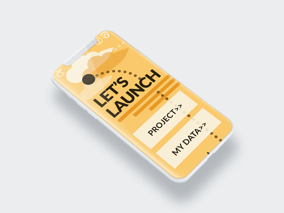
I chose an abstraction of a catapult as my final logo design, keeping with the sleek and modern look that I want the app to achieve.
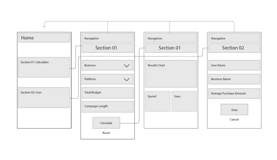
With my branding established, I fleshed out the wireframes used in my previous user testing. and moved on to user testing round 3.
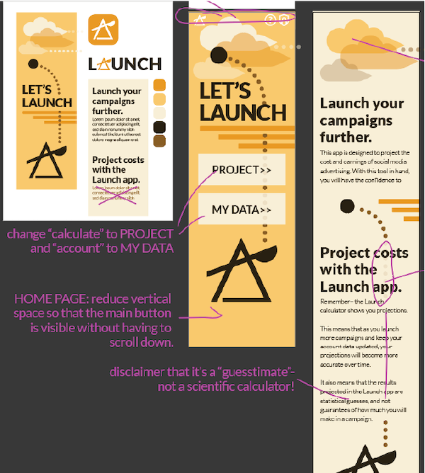
User feedback was enormously helpful in this design process.
I went through 3 rounds of user testing, with 3 participants in each round. It was reassuring to see the increasingly positive feedback and ease of navigation with each iteration. It was also eye-opening to see that the user feedback process could just keep going... and going! With so many different backgrounds and perspectives, my wonderful test users brought something different to the table with each new attempt. And most of their suggestions were things I had never thought of. By having people interact with the prototype with a clear mind, I gained unbiased insights about the look and functionality of my app.
Final Design
All design work and content © Autumn Howard 2020